

WHAT'S YOUR FAVOURITE COLOUR?
Psychology of colour is an often misunderstood field prone to assumptions and pseudo-science such as red = passion, green = sustainable and yellow = happiness. However, colour theory is not a “fluffy” subject – colour has real and measurable effects on humans.
DISCOVER
For a subject that has such a significant impact on our lives, there are surprisingly few studies relating specifically to architecture and interiors. During the 1960’s, Faber Birren and painter Josef Albers wrote on the effects of colour. Birren concentrated on light and colour in the work place, while Albers’ work on colour and its behaviour in different contexts is still seen as a primary resource for artists and designers. You can now download an app based on his colour theory, called Interaction of Colour.
Deborah T. Sharpe’s work from the late 70s and 80s, analyses colour in architecture from a commercial and socio-cultural perspective, exploring colour’s relationship to cultural customs and symbolism. Frank and Rudolf Mahnke wrote in the 1990s, building on Birren’s work on the relationship of colour to light, especially in human-made environments, and developed a framework for using colour effectively.
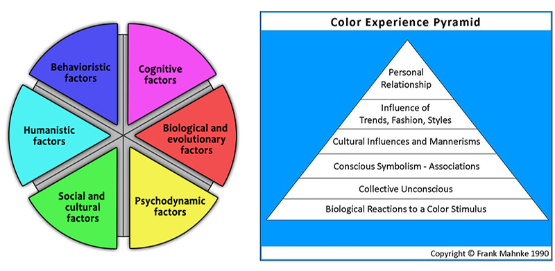
Six major psychological perspectives in the experience of colour were identified by Passer, Smith, Holt, Bremner, Sutherland & Vilek in 2009. Each of these factors is felt simultaneously, and will change in dominance, depending on the individual’s subjective life experiences and memories.
Human responses to colour are both psychological and physiological, and the effects on the mind and body can’t easily be separated.
Source taken from www.cincin.sg
Psychological responses to colour range from conscious reactions (at the top of the pyramid) to the unconscious and sub-conscious (at the base). Some examples are noted below.- Personal relationships,
(memories, subjective experiences and associations)
- Fashion and trends,
(a colour identified as “the new black”)
- Cultural influences,
(white as an Eastern mourning colour and a Western bridal colour)
- Conscious symbolism,
(“green” with envy as a cultural expression)
- Collective unconscious,
(inherited archetypal images)
- Biological
(a primal reaction to blue food is one of danger, potentially poisonous)
Our guest writer is from Edminston Jones (Australia), BRDB's appointed Architect for Parq on Flinders
For more info, check out www.parqonflinders.com.au